When I am overwhelmed with the urge to draw something, usually I am at a loss as to what I should draw.
The ‘image in my head’ is too vague, and my imagination has way too high expectations for what my hand can translate into a drawing. For some, it seems they can just pop out a good design, in a good pose, in a good environment, ink and color that bad boy and BOOM. Art.
Maybe I’m just not practiced enough to be able to do that, maybe I don’t have as clear an image in my head as they do. But what I do have is an idea and a strategy.
The idea: dragon
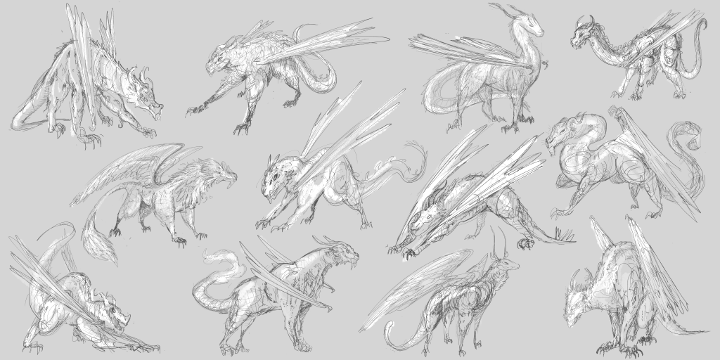
Simple true, but I’ve had a few subsets of ideas I was eager to explore within the simple concept. What makes a design a dragon? It is going to need all the basics, a body, head, limbs, wings, and a tail. So all of these have those.
The safe bets for what will immediately read as a dragon have been referenced from lizards, fish, and dinosaurs.
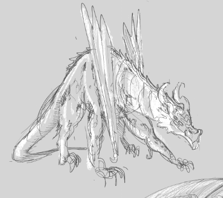

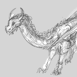
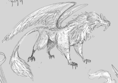
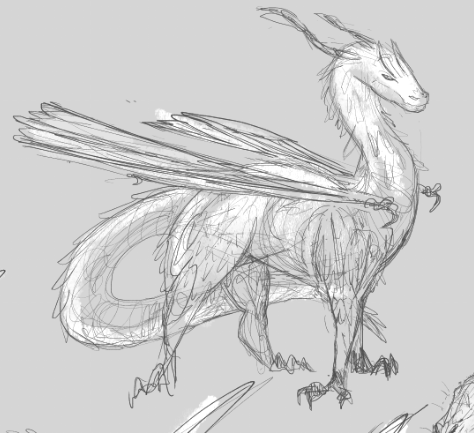
But what I found out pretty quickly is that that’s not all it takes to make something read as a dragon. The following “dragons” were referenced from more mammals and birds, and read as more creature or beast, but at first read I probably wouldn’t say dragons.
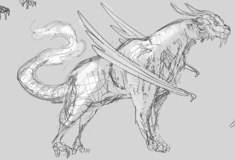
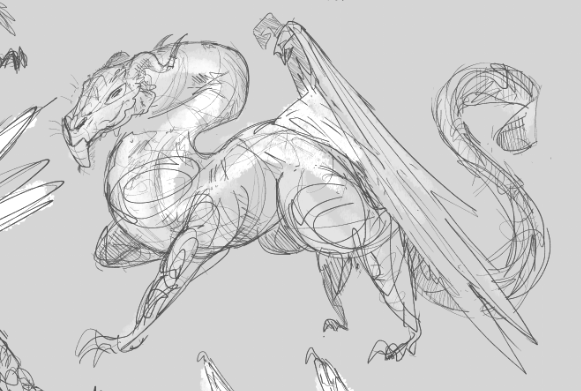
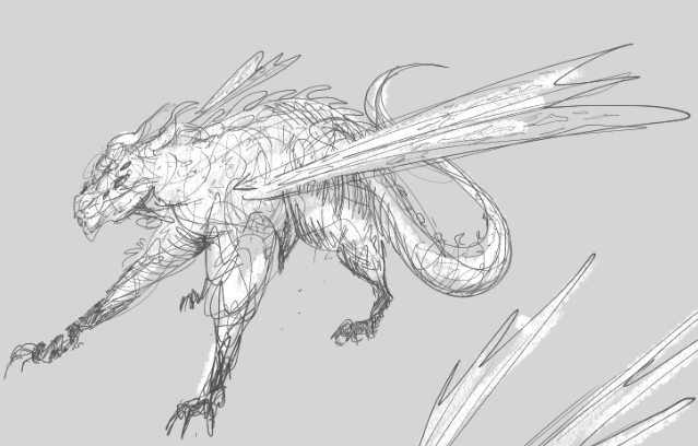
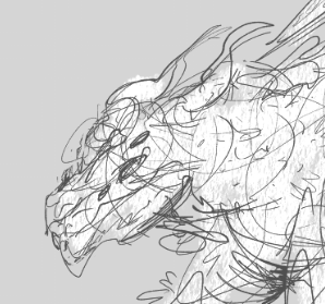
I’m most fond of the first sketch, which was mainly referenced from prehistoric saber tooth cats. I think the body shapes are pretty fun, and I love a top heavy creature. I gave it the flappy bat wings, to push it back to the dragon territory, but I don’t think I really succeeded in doing so. Still, a cool creature I’d like to get back to some day.
The feathered wings were a fun exploration but ultimately made both designs read more like griffins or hippogriffs.
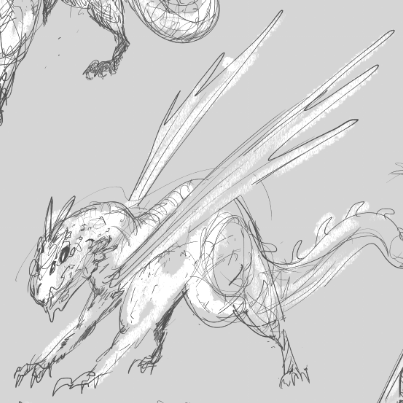
The middle design, slender and sleek, was referenced from deer and antelopes which gave it a body that looks pretty agile and fast as well as some very pointy antler-like horns.
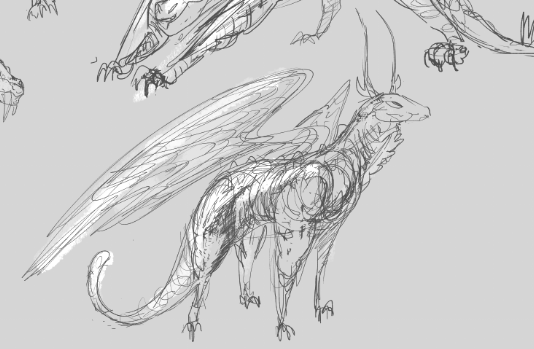
It’s counterpart is bulkier and carries more mass overall. For this design I referenced various big cats for the body, and I thought a chicken would be fun to use for the head because of that thing that dangles off their faces and their combs are pretty awesome. I thought if I explored this design further I’d definitely use more chicken references.
These guys are weird. I do feel like they all read as dragons but not quite the way I would typically imagine a dragon. I’ll give a brief breakdown.
The first and second designs shown here are not my favorites in the batch, but I can appreciate some of the ideas I explored.
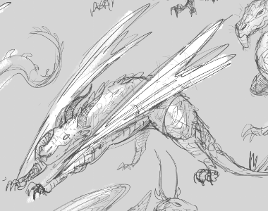
I do like the attitude in the first design, I think it has a lot of personality in the posing and face. I named his layer “posh dragon” because he felt kind of proud and is holding himself well.
The second design, was actually the last dragon I drew for the exercise. You can see I’ve run out of steam here and I really feel like I lost the head and face. If you put your thumb over his face the rest of it isn’t so bad, but for characters and creatures your eye naturally goes to the head first, and if it doesn’t like what it sees… it won’t even give the rest of it a fair chance. So throw your thumb over that bad boy’s face and see for yourself!
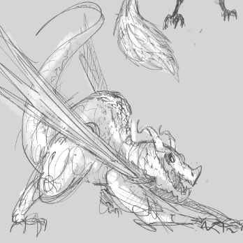
The last design shown here is actually the first sketch I made for this entire exploration, and I love it. I really do. I think it’s great, it has 6 eyeballs, a long skinny tail, big flappy wings, and a smirky little face. I mean come on look at him!
I referenced pet rats for him, because they are so cute, and I just wanted a friend.
so cute, definitely friend shaped!
So that’s it, I’m going to narrow these designs down to just a handful, and do a second design pass! Let me know which designs you think should make the cut!

Pingback: Designing Dragons: Scale – Nocturnal Art Blog